In today’s world, information technologies and the products of these technologies have become a part of us as well as making our lives easier. The technology that has developed from the past to the present has also created its own titles and sub-titles in this process. When it comes to information technologies, software comes to mind first. The software controls the operation of the devices that we use frequently in today’s world and in the recent past, and their functioning in a certain order while working. The software can be thought of as a manager working as a technical integrity in the background with many mathematical and logical formulas. While using the software for the intended purpose, the user must control it in a certain visuality. In this context, the term “interface” comes into play. In its most basic form, the interface can be defined as the screen(s) that users see while using software or websites.
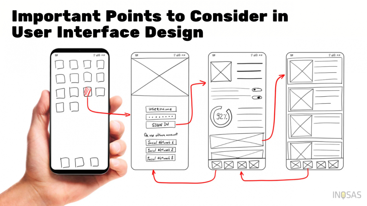
The interface can be defined as the screen-screens that users see while using a certain information technology. In this context, the interface has many technical sub-titles. For example, UI experience, UI design, heatmap, color scheme, and typography. In the light of these examples, the interface can be divided into two main headings as user experience and user interface design. In this article, we will focus on user interface design, sub-headings and points to be considered rather than user experience.
Since the interface consists of visual signs, colors and stimuli, it is necessary to pay attention to these issues while designing the interface. The use of icon-signs in a way that does not confuse the user increases the user experience. The use of signs-icons that are independent of each other and that do not contain any semantic integrity cause users to get lost in the application or website and reach the point they want to reach later. This greatly reduces the user experience. However, the choice of color is another important criterion. Psychologically, each color and sub-color has an effect on human psychology. For example, the color black appeals to feelings such as weight, power, passion and ambition, while the color white appeals to feelings and thoughts such as novelty, reliability, hope, purity, innocence. In the light of this information, the choice of color in the interface design creates the attitude of the user towards the application, and indicates which emotions, thoughts and feelings the application will appeal to the users. Another visual aspect in interface design is the selection of images to be used in the application or website. Visual use is more important in website interfaces than application interfaces. While designing the website interface, the use of visuals related to the content is a supportive factor in terms of user experience, considering the purpose for which the site is opened and for what purpose it will be used. For example, the images that a company will use for its website should have more corporate lines and colors, so it gives a reassuring and professional image to the visitors coming to the page.
Heatmap is another important topic in terms of user interface design and user experience. A heatmap can be defined as the set of points that a user most frequently navigates on the software, website and device they use. For example, on a website, users mostly access the upper left and lower right sections, while on other devices, such as mobile devices, this may change to points that the finger can reach. In the light of this information, the heat map should be considered in order to provide a more efficient user experience while designing the user interface. Positioning the tabs that users use more frequently according to this heat map will provide a higher level of experience to the user. Likewise, if the website or application is in a structure that includes the use of buttons, positioning the button positions in line with this heat map will provide a high-level user experience.
We have seen in the examples given that visuality and user experience based on visuality are at the forefront in user interface design. Another important point that can be given to these examples is typography. Typography can be thought of as the compatibility of the font(s) used in the application or the website, the suitability of the font sizes, etc.. Looking at a screen that is different from each other, regardless of size or thickness, on the screen that users see while using an application or website is a situation that reduces the user experience and makes it visually tiring. Therefore, the use of fonts, sizes and thicknesses used in written texts as a whole and in accordance with the content and characteristics of the application or website provides a higher quality user experience while not visually tiring the user. Not only the size and harmony, but also the location of the texts and the arrangement of the paragraphs increase the user experience in terms of visuality and comfortable reading-following.
The interface, whether software or website, is the end point that end user’s encounter. Therefore, while aiming to provide the end user with the best experience in terms of experience, it is essential to support this process with visual stimuli and pointers. Because user experience and user interface design are inseparable and support each other.